


Georgian interiors evoke sophistication and elegance through high ceilings, dramatic columns, delicate wallpaper and pastel colour schemes. It covered the years from 1714 to 1830 when four consecutive King Georges were on the throne. One of the most enduring styles through the Georgian period was the Neo-classical, based on Roman and Greek architecture and championed by architects such as Robert Adam.
The typical features included:
- Roman-inspired elements such as niches and alcoves
- Balanced and symmetrical designs
- Use of three Classical columns – Corinthian, Ionic and Doric
- Stonework, ironwork and marble with motifs such as the Greek key pattern, ribbons and garlands
- Carved Roman god and goddess statues
- Classical figures, vases and urns
- Pastel colour schemes, especially pea green and pink
How can we adapt Georgian interiors in today’s world?
- Combine traditional and modern elements – for example, add a modern chandelier or a piece of minimalist artwork to a room that consists of Georgian furniture to create a stylish contrast.
- Using the right colours – for example, hand-painting a piece of furniture to create a statement in a rich jewel tone.
- Mixing textures and materials – mix silk and velvet with contemporary materials such as concrete and metal to create an eclectic, modern look.
- Incorporating technology – add smart home technology and entertainment systems to your entertaining space.

Some of the most common colours used in Georgian interiors
Neutrals
Shades of white, cream and beige are often found in Georgian homes to create a sense of lightness and airiness. These colours in particular provide a neutral backdrop that allows other elements to stand out.
Soft Pastels
Colours such as pale blue, pink and green are popular colours. They are subtle and soothing and can help to create a serene and peaceful atmosphere.
Rich Jewel Tones
Rich tones such as deep red, emerald green and sapphire blue can add depth and richness to a room. These colours are typically used sparingly as too much of them can overwhelm the space.
Metallics
Gold, silver and brass were also popular in Georgian buildings. These finishes can be used on light fixtures, mirrors and other accessories to add a touch of glamour and elegance.
Little Greene has put together a collection of colours that are popular today as well as being a standard pigment used by many of the great designers, we look at each one below.
White Lead
White Lead by Little Greene is a creamy white named after the original house-painting pigment, lead carbonate, created when ground with raw linseed oil.
This warm, creamy white has a subtle grey undertone that gives a timeless and elegant appearance. It’s a versatile colour and pairs well with both traditional and contemporary design styles. So if you are looking to create a classic and sophisticated look in your home, then White Lead is a popular choice. While it’s named after an outdated pigment, the modern formulation of the paint ensures that it is safe to use and provides a durable and attractive finish.

Whitening
Whitening by Little Greene is a crisp, bright white colour originally created by mixing chalk with water and a binder to make light reflective ceilings that are beautifully bright.
Create a fresh and light design in your home with this clean and classic colour.

Stone-Pale-Warm
Stone-Pale-Warm by Little Greene is a more honeyed tone than its cool counterpart but a soft tone versatile enough to mix with plenty of colours on the colour chart.
This warm colour helps create a sense of warmth and comfort for a wide range of interior styles and design schemes.

Olive Colour
Olive Colour by Little Greene is a fashionable colour despite its price tag. Mrs Delany, the 18th-century writer painted her English room a sort of olive for the sake of her pictures.
The warm, earthy green colour consists of subtle hints of yellow and brown, which are rich and inviting, creating a welcoming and relaxing atmosphere that’s perfect for a range of interior styles and design schemes, including rustic, traditional and bohemian.

Invisible Green
Invisible Green by Little Greene creates a home with a sense of calm and serenity. Humphry Repton a landscape gardener made this colour popular by recommending it for fencing and railings so they would blend better with the background vegetation.
Subtle and versatile, it’s the perfect choice for a range of interior styles and design schemes, including modern, minimalist and Scandinavian.

Chocolate Colour
Chocolate Colour by Little Greene is an almost edible shade that is believed to be painted on the front doors of Frederick Handel and Benjamin Franklin. Use this dark shade in an all-over scheme to create a cocooning and comforting space or create a strong focal point alongside a related white like Flint.
The deep, earthy brown colour helps create a warm and welcoming atmosphere, that’s great for a range of interior styles and design schemes, including rustic, traditional and eclectic.

Sky Blue
Sky Blue by Little Greene brings the summer sky indoors with a Prussian blue, it was first used in the dining room of Moy House. As the name suggests, it is a light and bright blue colour that is reminiscent of a clear blue sky on a sunny day. Pair it with other colours including crisp whites, warm neutrals and bold accent hues.
The cheerful and uplifting colour can help create a sense of calm and tranquillity.

Pearl Colour
Pearl Colour by Little Greene is a grey variant which was listed by Sir William Chambers as ‘used on the beds of elaborate late 18th century ceilings’. The pearly off-white colour consists of subtle hints of grey and beige and is a warm and welcoming colour that can help to create a sense of calm and relaxation.

Book Room Green
The Book Room at Wimpole Hall was remodelled by neoclassical architect John Soane in the 19th century. This neutral green was added to the structure of the room next to the fine white plasterwork and shelving, and the thousands of deep red embossed leather book spines which covered the walls.
It pairs well with various other colours, including warm neutrals, rich browns, and deep blues and greens. This particular green is a great choice for living space creating a sense of warmth and intimacy.

Lead Colour
Lead Colour by Little Greene is a light grey, another “common” Georgian colour which once graced the London residence of composer George Frederick Handel. The smokey grey colour within is inspired by the traditional use of lead pigments in paint production.
Are you looking for a moody and sophisticated style in your home? This colour is strong and striking which can help to create a sense of depth and drama.

Mid Lead Colour
A darker lead colour that provides a more powerful finish and was favoured on woodwork and doors through the Georgian period.

Dark Lead Colour
Durable and used mainly on ironwork and gates during the Georgian era. This dark grey paint works well in small living spaces to create a sense of intimacy and an encompassing feel.

Boringdon Green
Boringdon Green by Little Greene is deep and rich that takes its name from Boringdon Hall, a historic manor house located in Devon. The colour pairs well with various other colours including warm neutrals, soft pinks, and rich blues and purples.
It’s a soothing and grounding colour that can help to create a sense of balance and harmony.

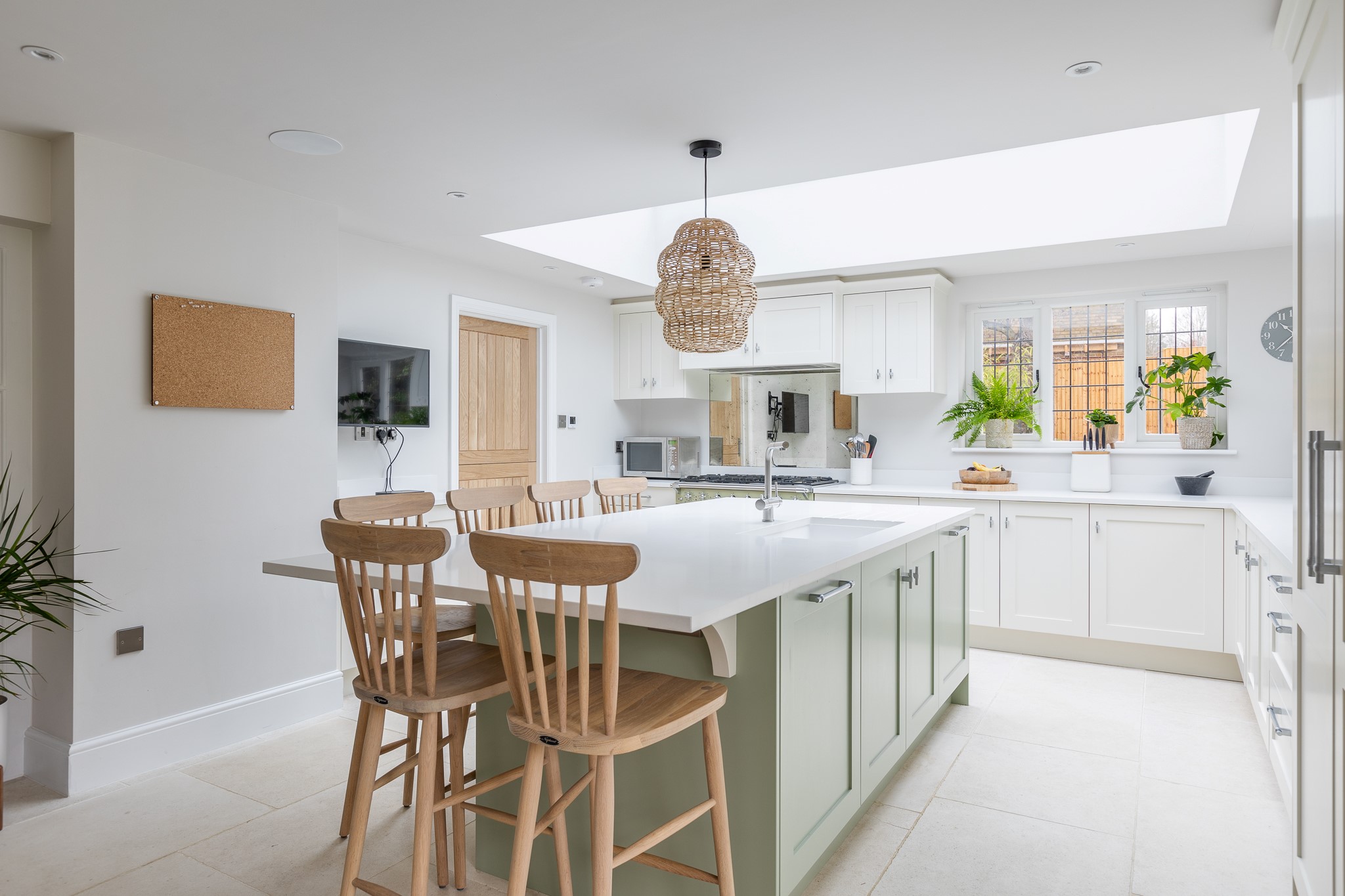
This kitchen design we created in Digswell, features Little Greene’s, Boringdon Green. We hand-painted the island in this soothing and grounding colour to create a sense of balance and harmony in the large open-plan space and matched the tones of the Lacanche range cooker.
Putti
Putti by Little Greene is a soft, green colour with a hint of pink that is inspired by the traditional use of putti, or cherubs, in art and architecture. It’s the perfect choice for homeowners looking to create a sense of warmth and intimacy in their homes, thanks to its soft and soothing colour.

Windmill Lane
Windmill Lane by Little Greene is a soft, muted green seen from the main stair and north passage of the glorious manor house located in Osterley Park, London. Originally built in the mid-1500s, it was remodelled 200 years later under the direction of celebrated architect Robert Adam.
This colour is a true definition of his exquisite taste and understanding of colour.

Tea with Florence
Tea with Florence by Little Greene is a soft, warm blue colour with a hint of pink that is inspired by the delicate shades of tea-stained lace. This colour is the highlight of Claydon House in Buckinghamshire, the Chinese Room, which is widely considered to be the finest surviving example of Chinoiserie in Britain.
The famous Chinese Room was a private sitting room and a place to make tea for visitors including Florence Nightingale.

Scullery
Scullery by Little Greene has been taken from the pantry door at Wimpole Hall. This shade is typical of the drab colours used to paint ‘back-of-house’ areas, where waiting staff would prepare meals and refreshments for the owners of such grand country mansions.
This rich and inviting colour helps create a cosy and welcoming atmosphere, making it a great choice for kitchens and other communal spaces in particular.

Visit these places for an example of a Georgian-style interior.
Peckover House, Cambridgeshire
Castle Coole, Northern Ireland
If you would like more information on our handmade bespoke kitchen designs contact us today. We can create your dream handmade kitchen using these Georgian colours and build a bespoke space for you and your family.


