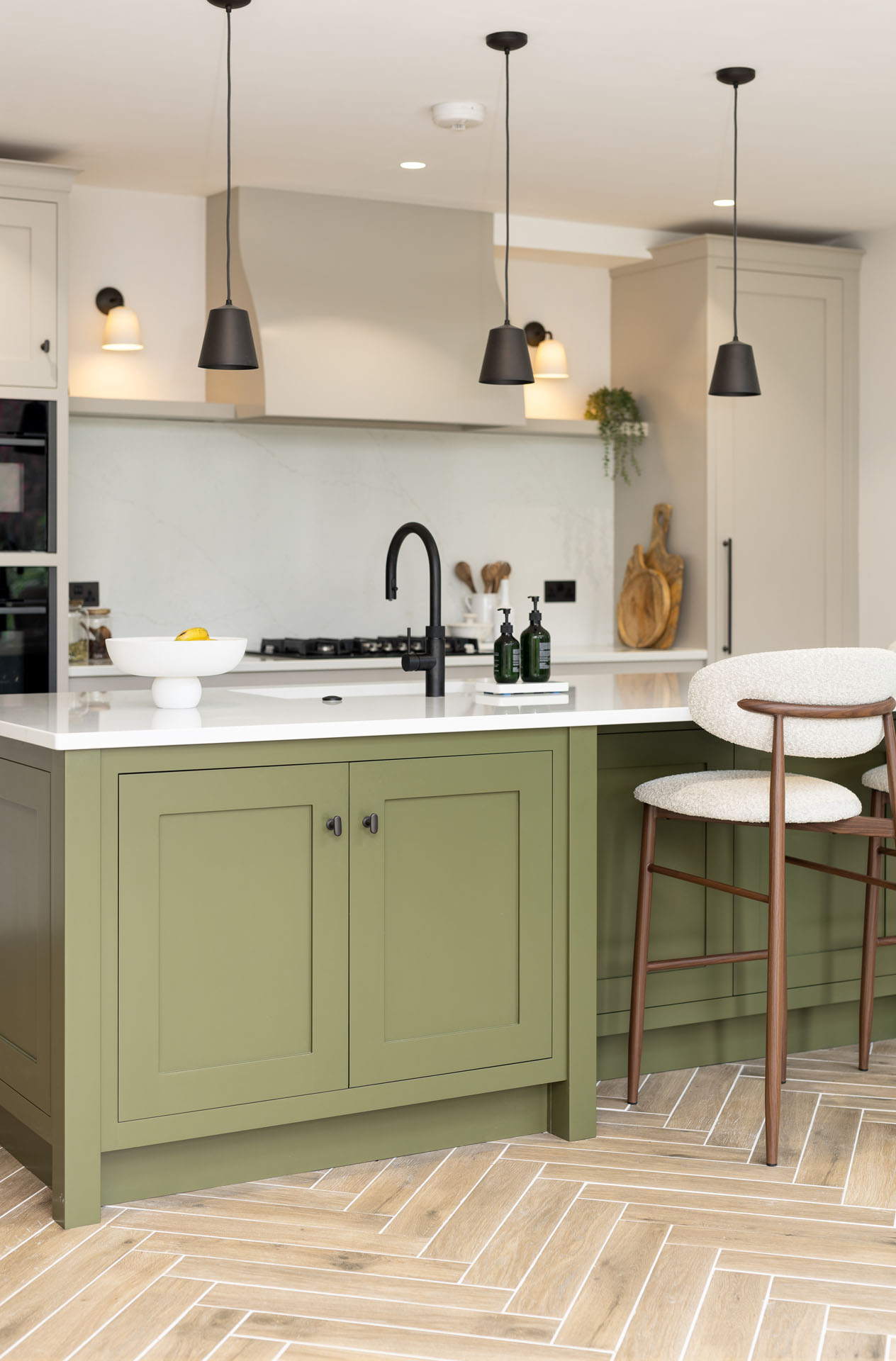


We hand-paint our kitchens with the highest level of care, and colour is one of the most important elements of every one of our projects. Following the success and love of our latest portfolio in Letchworth, we felt inspired to dive deeper into the brand’s newest colours.
COAT paint is perfect for a whole kitchen renovation or simply refreshing your home, and their new tones open the door to endless styling possibilities. With such a varied palette, the colours continue to evolve the aesthetic needs of modern living, offering a range of shades that feel warm, grounded, and effortlessly livable.
In this blog, we unveil the new colours in the palette. However, before we do that, we take a look at why COAT remains one of the most beloved paint brands for designers and homeowners who care about sustainability, quality, and long-lasting colour.
Why Choose COAT?
COAT paint is different; it solves every problem when it comes to choosing paint colours. The brand is set out to streamline the paint-buying experience, curating a thoughtful palette that is loved by many. They cut out mass-production waste and deliver exceptional quality paint.
You will instantly get a clean, modern colour, formulated with premium materials and consciously produced with none of the industrial waste that defines traditional paint manufacturing.

Introducing the New COAT Colour Palette
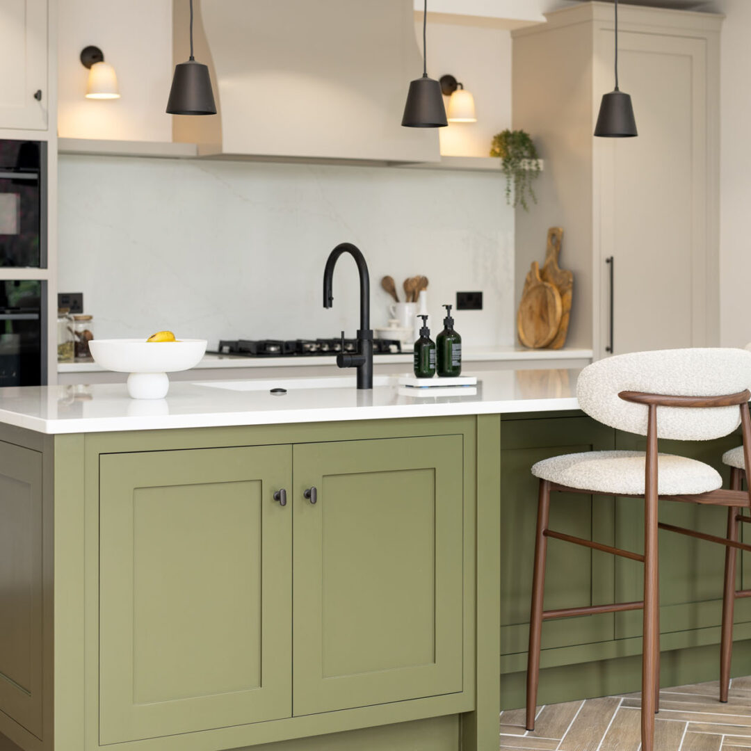
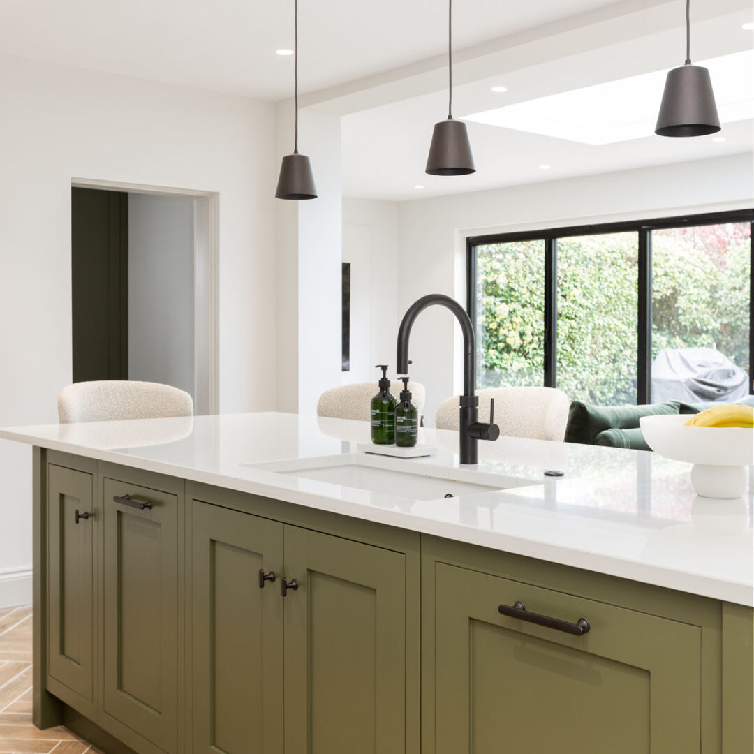
With 2025 drawing to a close and a new year on the horizon, COAT has expanded its range with a curated selection of versatile new colours. The range is a collection of warm neutrals, moody greens, soft pinks and earthy reds. Each shade carries the timeless, understated aesthetic that COAT is loved for.
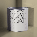
Ode To Toad – Light Olive Green
A nostalgic green that balances nature and a warm vintage feel.
Sonder – Mid Sage Green
Where warm grey and soft sage are blended to capture the quiet realisation that everyone has their own story to tell.

Jonah – Deep Grey Green
Deep yet understated, this grey-green has a quiet, resilient character. With a natural olive feel, the touch of grey balances the shade perfectly.
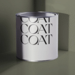
Retrograde – Deep Green
A moody blend of deep green and muted grey captures the view that you should only look back whilst moving forward.

Reverie – Light Earthy Pink
This gentle pink feels daydream, grounded and deeply calming.

Sybil – Deep Plaster Pink
Sybil blends terracotta and muted pink for a contemporary take on a deep plaster colour.
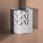
La Torre – Soft Earthy Red
Capturing the final moment of an Ibizan sunset, La Toree is where soft reds bleed across the horizon and a colour that doesn’t shout.

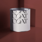
Smith & The Devil – Dark Earthy Red
This aged red is unexpectedly comforting. Use sparingly for an injection of intrigue, or embrace your darker side!
Naptime – Beige White
With the look of natural linen, Naptime is a colour that feels both grounding and airy. This sophisticated tone brings a sense of calm and warmth.

Off Script – Beige Off-White
This soft neutral is warm and effortless, inspired by spontaneity, and is the perfect warm backdrop for colourful art, furnishings, and a life well lived.
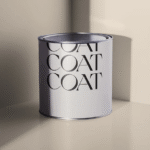
Camber – Pale Beige
With a hint of Sussex sand, Camber is a beautiful blend of beige and muted taupe that gives a naturally warm feel, without being yellow.

Rooted – Mid Beige
Balancing a blend of beige and soft brown, Rooted is a unique and versatile neutral.
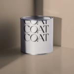
Percolate – Beige Brown
Percolate is a modern take on brown, it isn’t quite choclate-y, it’s just more hushed and earthy.
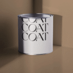
Corked – Mid Plaster Beige
Containing subtle pink undertones in an earthy taupe, Corked is deep and comforting without being bold.
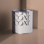
Sweater Season – Pale Sand
Sweater Season is an earthy neutral shade with a comforting, knitted feel. Its blend of sand and grey makes it a versatile neutral.

Cheap Soufflé – Cream Yellow
This light, understated natural yellow has a playful side, blending the best of soft beige and butter yellow for a modern twist.
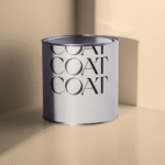
Cake Mix – Warm Sand
Perfect for the kitchen, this warming sand beige is ideal if you like the idea of yellow, but want a more mature version.
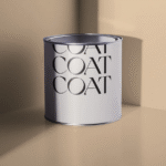
Gwen – Golden Sand
Rich, deep, sandy and beige, Gwen is channelling all the warmth of yellow.
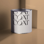
Dalston Chat – Sand Brown
Sophisticated, deliberate, Dalston Chat is a deeply complex colour. It combines beige, greige and taupe.
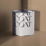
We Have Found a Love for COAT in Our Bespoke Handmade Kitchens
We have found that working with COAT enables us to deliver beautiful furniture. The depth of each colour suits both traditional in-frame kitchens and sleek contemporary spaces, allowing our craftsmanship to stand the test of daily family life.
A new love is formed through the partnership of handcrafted joinery, statement worktops, and hardware, making COAT’s new palette a modern addition to a personal interior.

COAT continues to be a premium paint, and their new palette of colours reinforces their mission to offer hues that capture today’s design sensibilities and the sustainable world we want to live in.
Our team are dedicated to hand-painting our cabinetry with reputable paint brands. If you’re considering COAT for your next kitchen or home renovation, we’d love to help you find the perfect paint colour.