
A grey kitchen idea can transform the design of the space, adding character, individuality and timeless elegance. It has become a popular shade to welcome a modern upgrade from classic white. Grey paints create different moods depending on both the strength and the warmth of the shade you choose, and where and how it’s used.
There’s more to this ultra-versatile neutral than you might think…
Light greys create clean, understated and effortless settings and a dark grey is a statement shade that’s still versatile enough to work with almost any other colour you can think of.
Farrow & Ball have a vast range of beautiful grey colours to suit your home. From the subtle tones of Ammonite to the cool blue undertones of Pavilion Gray to transforming rooms with moody and mysterious shades such as Down Pipe and Plummett.
A little history of Farrow & Ball
Farrow & Ball started in Dorset, back in 1946, when local pioneers John Farrow and Richard Ball shared a passion for making rich colours into original formulations using only the finest ingredients. Today the unique F&B look transforms modern and traditional homes, large and small, inside and out around the world.
In this blog, we will talk about some of the grey paints from Farrow & Ball in more detail and show you some examples of these in our hand-painted handmade kitchen projects.
Ammonite
Ammonite from Farrow & Ball is a naturally understated grey, named after the treasured fossils often found on the Dorset coast. It has a fantastically understated quality and sits effortlessly against the Relaxed Neutrals. Neither too warm nor too cool, its subtle grey tone creates a hushed and calming feel in homes both old and new.

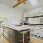
Ammonite Kitchen Project in Preston
To add to the modern living of this family space our client opted for Ammonite. This natural understated grey creates a calming feel and is super special.


Hardwick White
Hardwick White from Farrow & Ball is a traditional grey that was created to touch up the old limewash at Hardwick Hall. Less blue than Lamp Room Gray and with an unsurpassed depth of colour, this rich and chalky hue sits just as well in a contemporary room as it does in a historic house.

Hardwick White Kitchen Project in Knebworth
Complementing the statement island, Hardwick White completes this light, bright open-plan kitchen. A gorgeous chalky hue that works with the burnished brass Armac Martin handles and the antiqued mirror splashback.


Hardwick White Kitchen Project in Hertfordshire
The perfect colour choice for this traditional style set in a listed home.


Manor House Gray
Manor House Gray from Farrow & Ball, named after the houses traditionally inhabited by the local lord, this definite grey retains its colour in all lights, especially when contrasted with Wevet. Cooler and cleaner in feel than Charleston Gray, this shade is very popular in hard-edged contemporary homes that are conducive to minimal living and is often used alongside the more dramatic Railings.

Manor House Gray Kitchen Project in Royston
This is a cool, country kitchen at its best, and the colour choices and finishes were key to a contemporary look. The calm colour scheme using F&B’s Manor House Grey for the main cabinets provides masses of light reflection but is also perfectly offset by the drama of the tall cupboards which are hand-painted in F&B’s Railings.


Pavilion Gray
Pavilion Gray from Farrow & Ball is a cool mid-grey, created for a bespoke pavilion, but is also reminiscent of an elegant 18th-century Swedish colour. From F&B’s Architectural Neutrals, this subtle colour with blue undertones adds a contemporary touch and sense of spaciousness. Combine with Dimpse, Blackened or Manor House Gray in any combination for a scheme that is perfect for the modern family home.

Pavilion Gray Kitchen Project in Lower Stondon
In this small kitchen project, our client opted for Pavilion Gray hand-painted onto the cabinets. The subtle colour and blue undertones found within add a contemporary touch and sense of spaciousness to this room that’s used for many things. This a perfect example of how a good design can create three distinct zones for relaxing, dining and cooking.


Down Pipe
Down Pipe from Farrow & Ball is a dramatic lead grey with definite blue undertones to it which deepen the complexity of the finish. Originally inspired by the colour used to paint downpipes and guttering, it has been embraced for use inside the home with fanatical zeal! This daringly dark hue is fabulous as a background to art and is extremely effective to create a deeply dramatic entrance to the home.

Down Pipe Kitchen Project in Welwyn Garden City
Our client in WGC opted for a two-tone colour scheme where the dramatic lead grey hue would be used on the main kitchen cabinets. The dark hue looks stunning contrasted with the copper accents and the off-white that you see on the kitchen island.


Down Pipe Kitchen Project in Walkern
This daring hue soaks up the handleless style perfectly, where the choice of granite worktops, black gloss appliances and touches of wood complete the design.


Down Pipe Kitchen Project in Bedfordshire
For a contrast in this open-plan kitchen, our client opted for the island to be hand-painted in Down Pipe. To finish off the super-sized work area is the Bianco Eclipsia Quartzite where this natural product pairs lovely with the dark grey.


Charleston Gray
Charleston Gray from Farrow & Ball is a warm and muted grey and is named after the much-loved home of the equally artistic and intellectual Bloomsbury Group in East Sussex. The brown undertones within create a warm, enveloping and hushed atmosphere.

Plummett
Plummett from Farrow & Ball is a strong architectural grey and is named after the lead often used by anglers to weight their lines. This particular grey intensifies in colour in smaller spaces and has a strikingly modern feel which is conducive to minimal living. Plummett is one of F&B’s most hard-edged and industrial-feeling greys.

Lamp Room Gray
Lamp Room Gray from Farrow & Ball is one of their collection’s most traditional blue greys. It was created when a white room had been stained by the trimming of lamp wicks. This particular grey creates a softer more lived-in finish than Pavilion Gray. Lamp Room Gray is surprisingly strong when used in smaller rooms but softens in larger, well-lit spaces.

Mole’s Breath
Mole’s Breath from Farrow & Ball is a timeless grey whose name takes its roots from the much-loved Elephant’s Breath, this moody hue is inspired by a smaller, furrier animal. It is one of F&B’s most versatile stronger accents particularly effective to ground kitchen islands and feels daring yet comforting when used in smaller rooms.

Would you like to introduce a grey hue into your handmade bespoke kitchen? Look no further than Planet Furniture. We pride ourselves on being truly bespoke, whilst using the finest materials in the industry. Contact us today to find out more and how we can give you the best grey kitchen ideas for your dream space.


